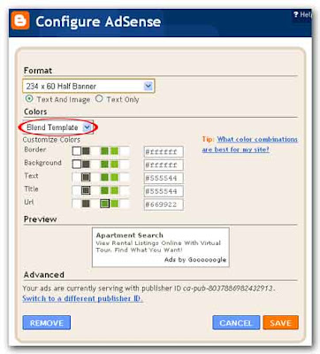
To get maximum revenue from your AdSense ads you should optimize them. The principle behind optimizing AdSenses ads is to make your ads look like part of your content, not like ads. Blogger assumes that’s how you want your AdSense ads to look. That’s why the default color scheme when you’re first asked to choose your ads is the “Blend Template.” This removes the borders from the ads, makes the background color the same as the background color of your blog’s template and matches the font color of the content and title of the ad to the content and title of your blog.
To format you’re AdSense ads you should login to your blogger account, on your dashboard click on the layout link.

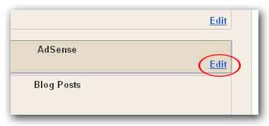
In page elements page click Edit on AdSense element.
Then the “Configure AdSense” page will be displayed where you can format your AdSense ads. Make changes you want to do, then click on the orange color save button.
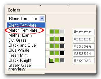
You’d better not to use any other color scheme than “Blend Template”. The match template is somewhat ugly and while choosing other schemes will make your blog look pretty, but they won’t do much for your income.
 When you’re going to optimize your AdSense ads, it’s very important to put the right ads format in the right places. Research has shown that wider ads are more successful. You start by placing one ad at the top of the page you’re likely to get the best results there with one of the following, the top three formats are:
· Large rectangle (336x280)
· Medium rectangle (300x250)
· Wide skyscraper (160x600)
Additionally, the 468x15 horizontal ad link under the navigation bar is also good.
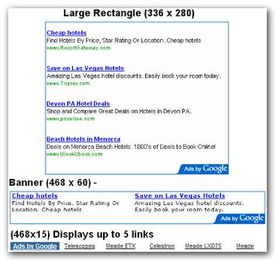 The horizontal text link will look like a menu bar of a conventional website. Sometime it will be good option for your page. The banner fills the space very neatly above the first blog entry. We’ll further discus how to optimize your AdSense ads in our next article, “How do I optimize my AdSense ads? II”
To format you’re AdSense ads you should login to your blogger account, on your dashboard click on the layout link.

In page elements page click Edit on AdSense element.

Then the “Configure AdSense” page will be displayed where you can format your AdSense ads. Make changes you want to do, then click on the orange color save button.

You’d better not to use any other color scheme than “Blend Template”. The match template is somewhat ugly and while choosing other schemes will make your blog look pretty, but they won’t do much for your income.
 When you’re going to optimize your AdSense ads, it’s very important to put the right ads format in the right places. Research has shown that wider ads are more successful. You start by placing one ad at the top of the page you’re likely to get the best results there with one of the following, the top three formats are:
· Large rectangle (336x280)
· Medium rectangle (300x250)
· Wide skyscraper (160x600)
Additionally, the 468x15 horizontal ad link under the navigation bar is also good.
 The horizontal text link will look like a menu bar of a conventional website. Sometime it will be good option for your page. The banner fills the space very neatly above the first blog entry. We’ll further discus how to optimize your AdSense ads in our next article, “How do I optimize my AdSense ads? II”